LISNR Content Portal
Web ApplicationUX & UI Designer
I led the UX architecture through visual and UI design into front end implementation of an internal customer portal that supported our mobile application and gave customer control over sharing their media in the LISNR mobile application
1Business Objective
I met with initial stakeholders (CEO, CTO and CCO) to discuss a potential identified need for customers to have a way to manage and share their own content in the LISNR mobile application. At the current time, this was not possible and there were many ineffective channels that this was being done (emails, texts, etc.) that frustrated customers in increased effort and time as well as strained internal LISNR team member capacity and bandwith. I was brought in to help understand users, their needs, and ideate on potential solution.
2User Sitemap & Flows
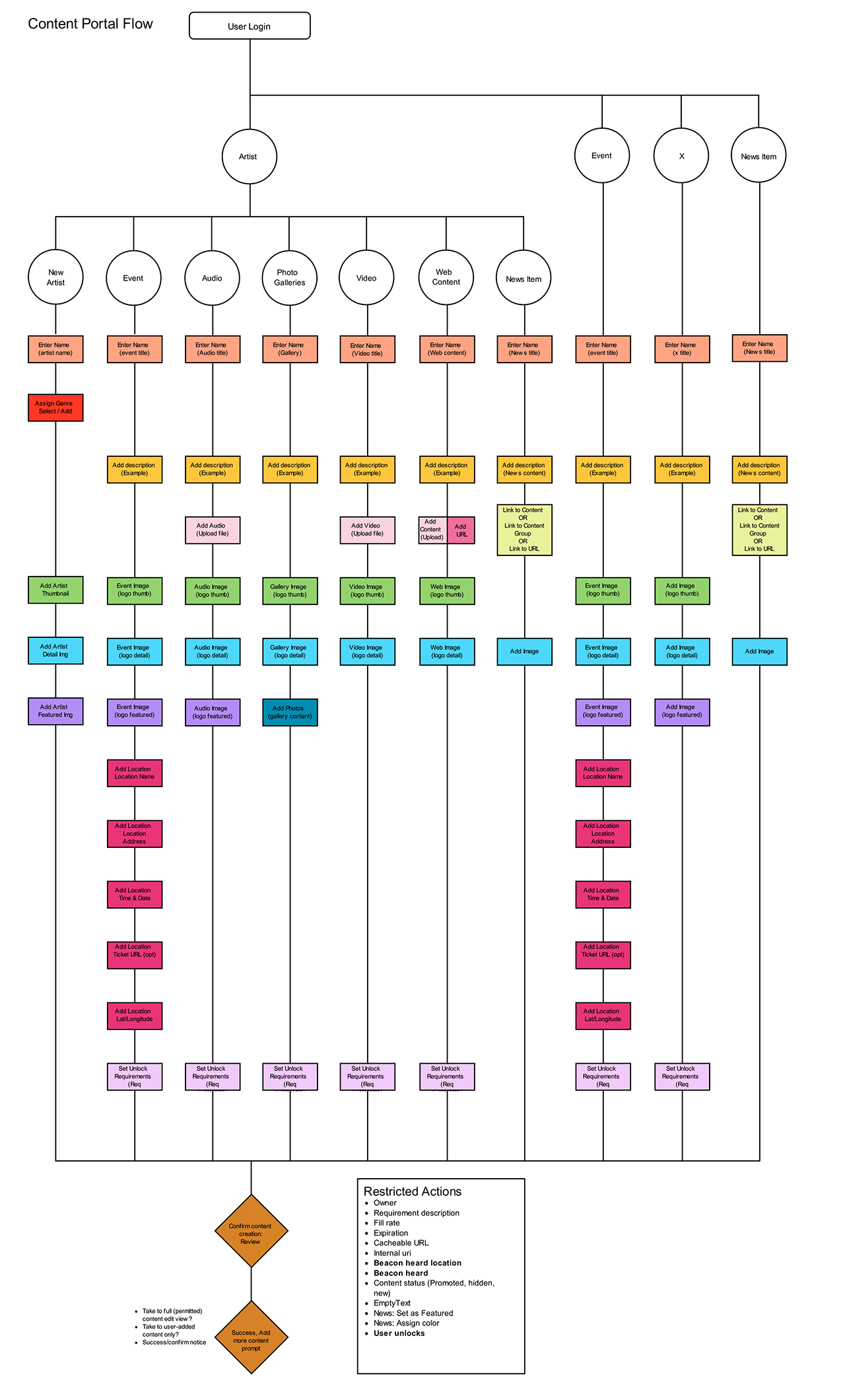
To better understand the overall architecture and flows, I created a brief overview of the main areas and functions of the portal as well as potential flows for each that showed how the user might navigate through.
3UX Wireframes
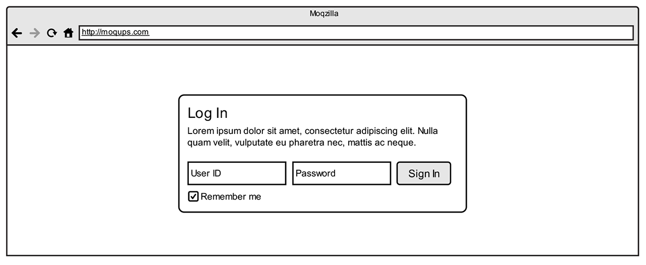
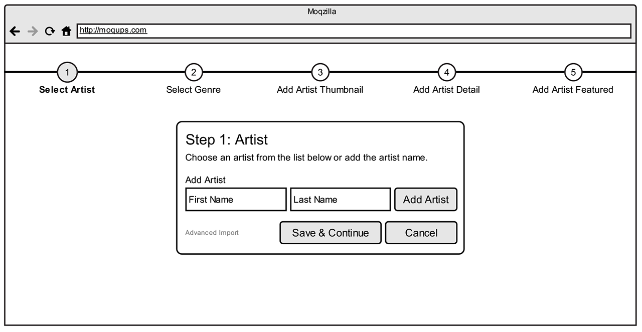
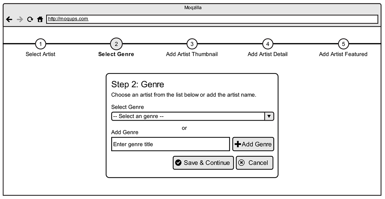
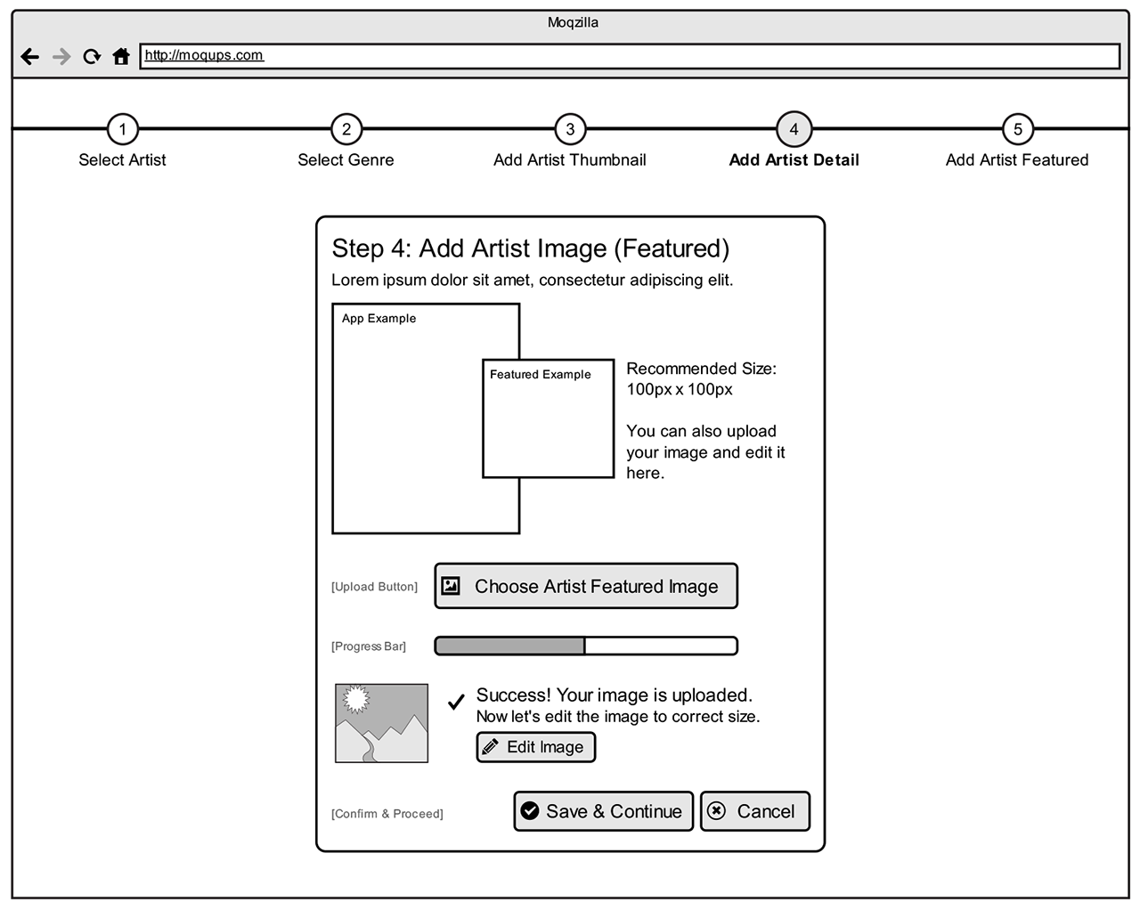
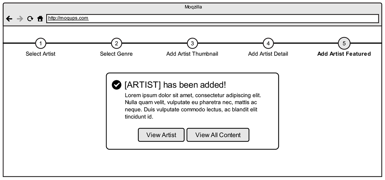
I created initial low-fidelity wireframes to explore initial flows and start to detail the interface architecture and design. Examples below show a potential flow of wireframes for adding a new artist to the LISNR mobile application.
3Visual UI Designs
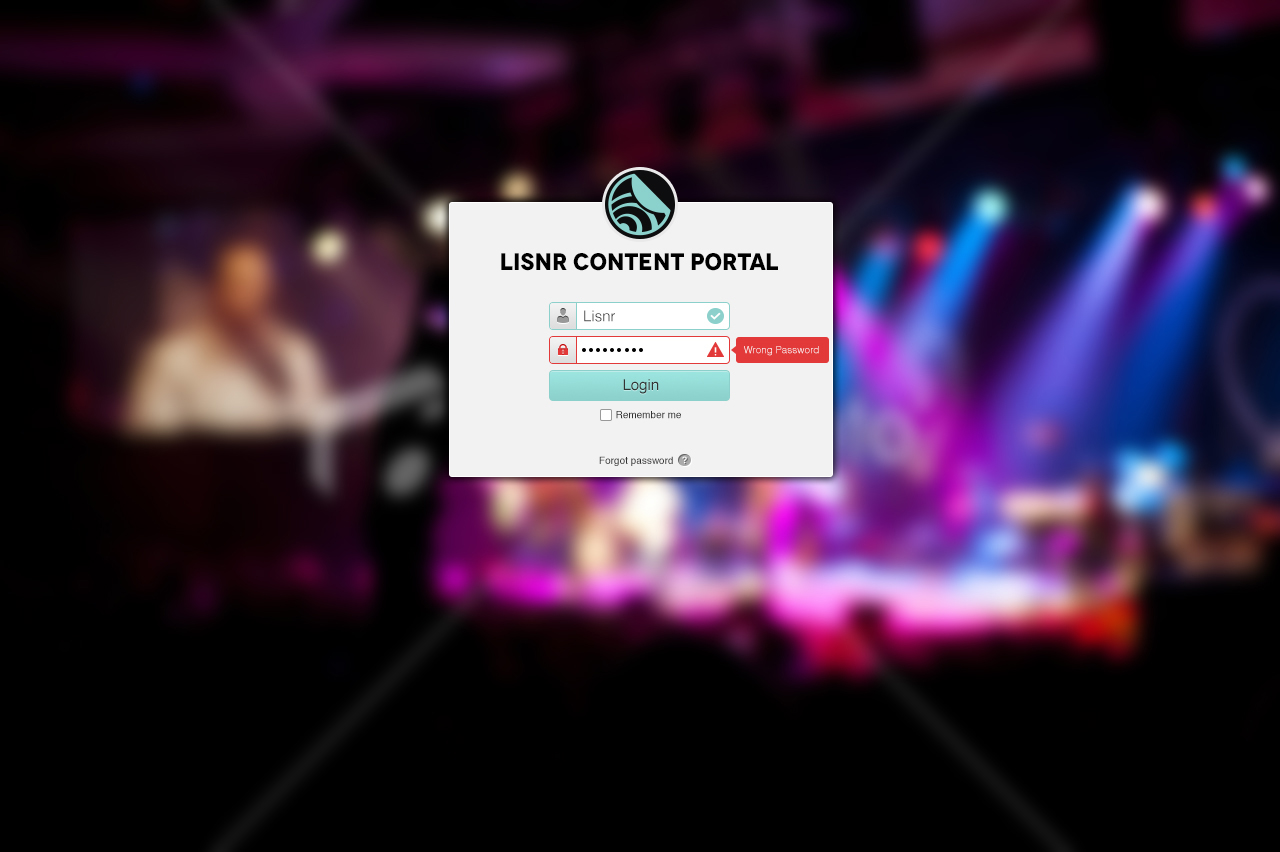
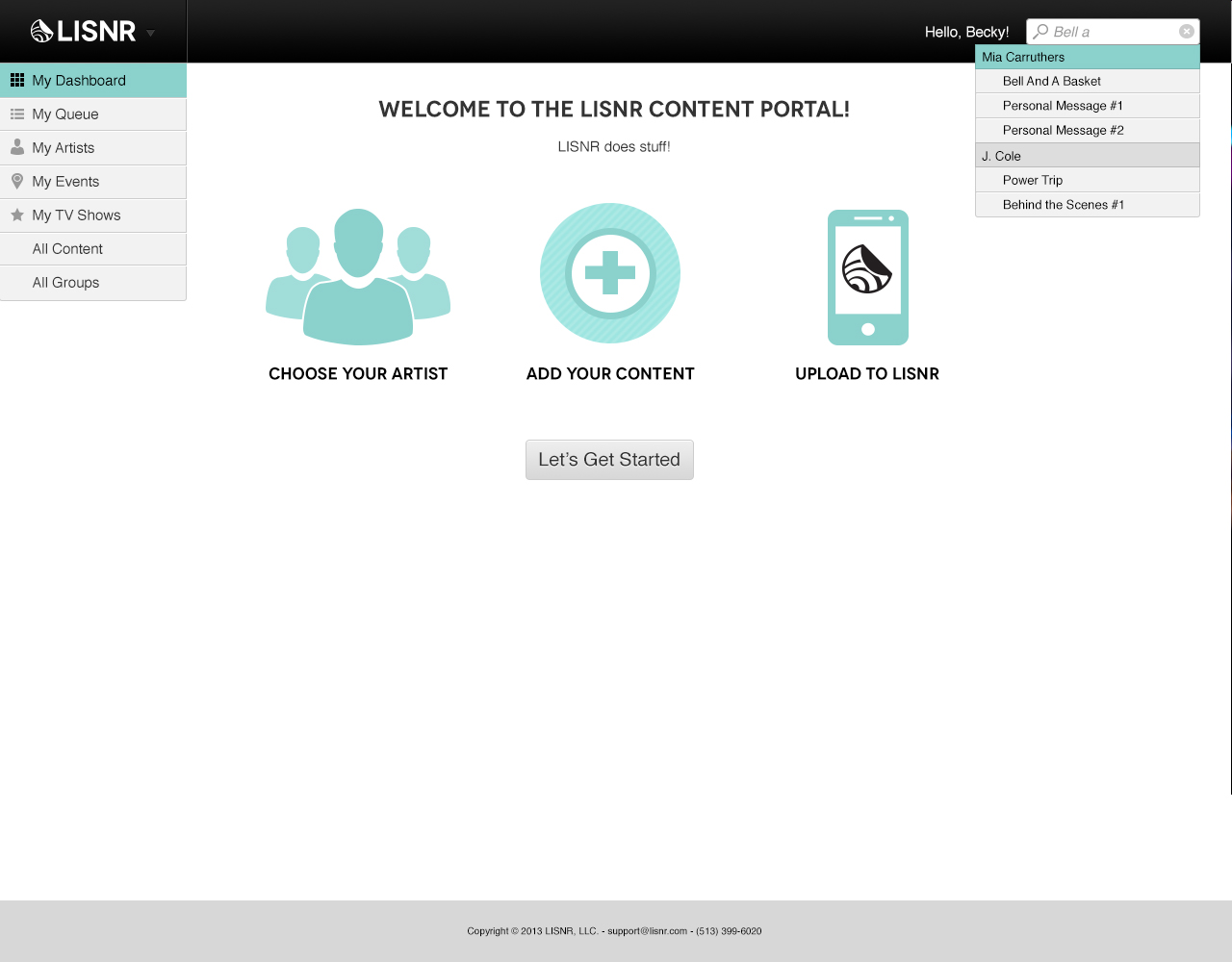
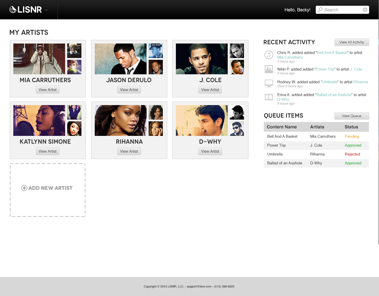
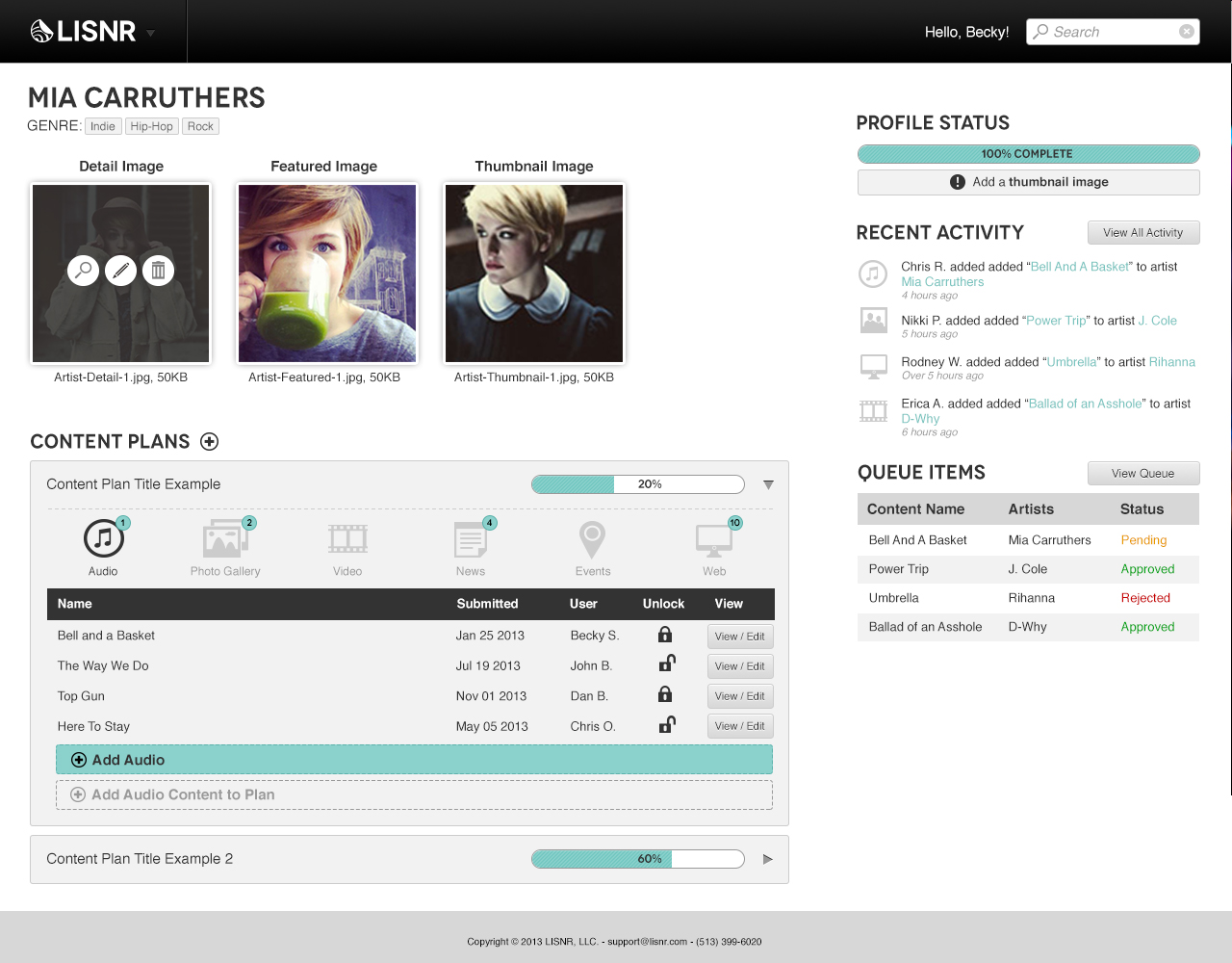
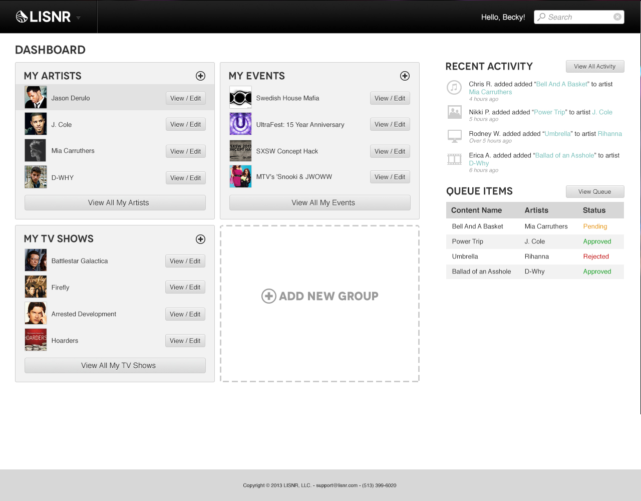
As I met with stakeholders and cross-functional team members across product, sales and engineering through the UX process, I would receive feedback and approval on wireframes and then take those to build into high-fidelity visual UI designs and interactive prototypes for the team to use and explore before implementation.
